
Refined accuracy in color perception
Middle Grey | 18% Grey | Neutral Grey | Munsell N5

Middle Grey | 18% Grey | Neutral Grey | Munsell N5
Grey Paint
Grey Paint is a spectrally neutral paint that you apply to the walls around your screens. This way you can be sure that you see colors on your screen correctly.
We mix an equal composition of every color in the color spectrum until we have the color that is exactly halfway between black and white. And that is a very precise matter.
With its extra matt finish, our mid grey paint provides neutral and minimal reflection. Essential in colour grading suites, design studios, (home) cinemas, museums, etc.
The dots have the same color
For real, use the colour picker!

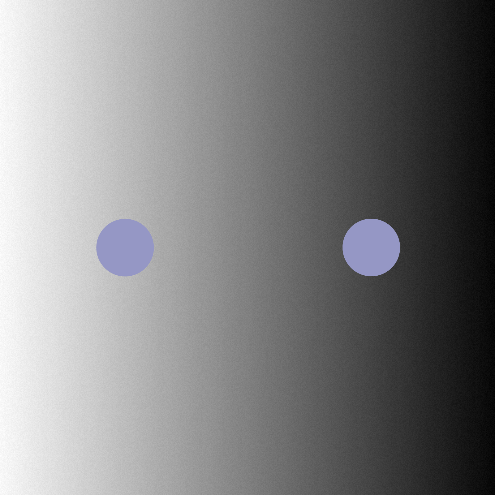
Don't fool your eyes
The human optical system is amazingly adaptive. Your brain compensates for color to a white balance. If there is a lot of blue in your field of vision, your brain balances this by adding the opposite color. This makes the dot in the purple area appear grayer than it actually is.
Imagine that dot is your expensive calibrated monitor, hence why those skin tones look so unhealthy in your renders.
Whether you work with film, video, photo or graphic forms: only if you perceive colours correctly, you will deliver the best result. A neutral working environment takes your work to a higher level.

The recipe
Grey Paint was created through a lot of mixing, testing and tweaking with the help of a specialized color lab. The result: the L*a*b* values are better balanced than those of the most sold gray card.
Every order is freshly mixed, tested and only shipped when the colour matches our reference. We re-test every new batch of base paint in the lab. This way we know for sure that Grey Paint is always a perfect mid grey.
Why not
Mix it yourself?
You can’t just have middle grey paint mixed at your local hardware store. You might find a grey sample that comes close, but getting that exact shade on your wall is a different story. The mixing methods simply aren’t accurate enough—the margin of error in the mixing machines is too wide, and no consideration is given to variations in the base paint. Base paint is never truly white and can vary in color from one production batch to another, even between pallets or individual buckets. Hardware stores don’t adjust their formulas to match different types of base paint.
The base paint we use for Grey Paint is the whitest and most consistent available, minimizing the risk of color deviations. Every batch is re-tested for accuracy.
Any deviation from true middle grey is measured in Lab* values, where L* indicates lightness, a* represents the red-green axis, and b* the yellow-blue axis. Grey Paint deviates by less than 1 point on each axis—an amount imperceptible to the human eye—and outperforms even the most well-known grey reference cards in color testing.
Satisfied customers


